> For the complete documentation index, see [llms.txt](https://docs.smarttradingindicators.com/smart-trading-indicators/llms.txt). Markdown versions of documentation pages are available by appending `.md` to page URLs; this page is available as [Markdown](https://docs.smarttradingindicators.com/smart-trading-indicators/our-indicators/shadow-trend/graphics-or-examples-of-what-it-looks-like-in-action-shadow-trend.md).
# Graphics or examples of what it looks like in action - Shadow Trend
{% hint style="info" %}
While I can't generate graphics directly, I can provide you with a detailed description of how they should look and how to interpret them.
{% endhint %}
Here are some scenarios you could illustrate with graphics for your Gitbook:
## **Basic Crossing Chart:**
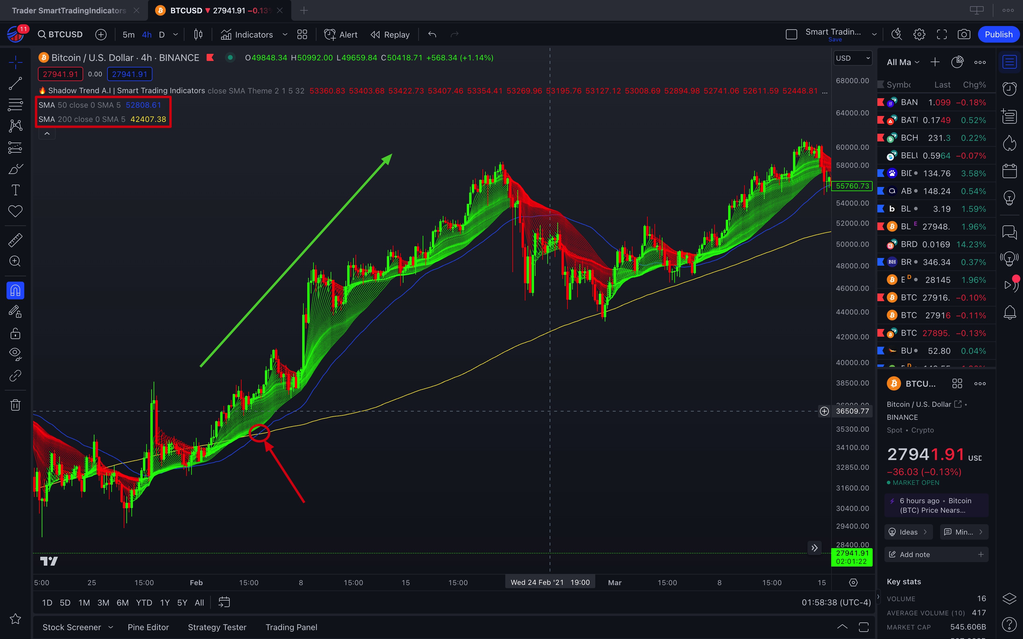
* **Interpretation:** This is a classic example of a "Golden Cross," which is a bullish signal. It is suggested that when a short-term moving average crosses above a long-term moving average, it could be a good time to buy.
## **Moving Average Divergence Chart:**
* **Interpretation:** Divergence between moving averages can indicate that a trend is gaining strength. If short-term moving averages quickly move away from long-term moving averages in an uptrend, it may indicate strength in the trend.
## **Moving Average Convergence Chart:**
* **Description:** Using a candlestick chart, show moving averages converging or coming closer together after a period of divergence.
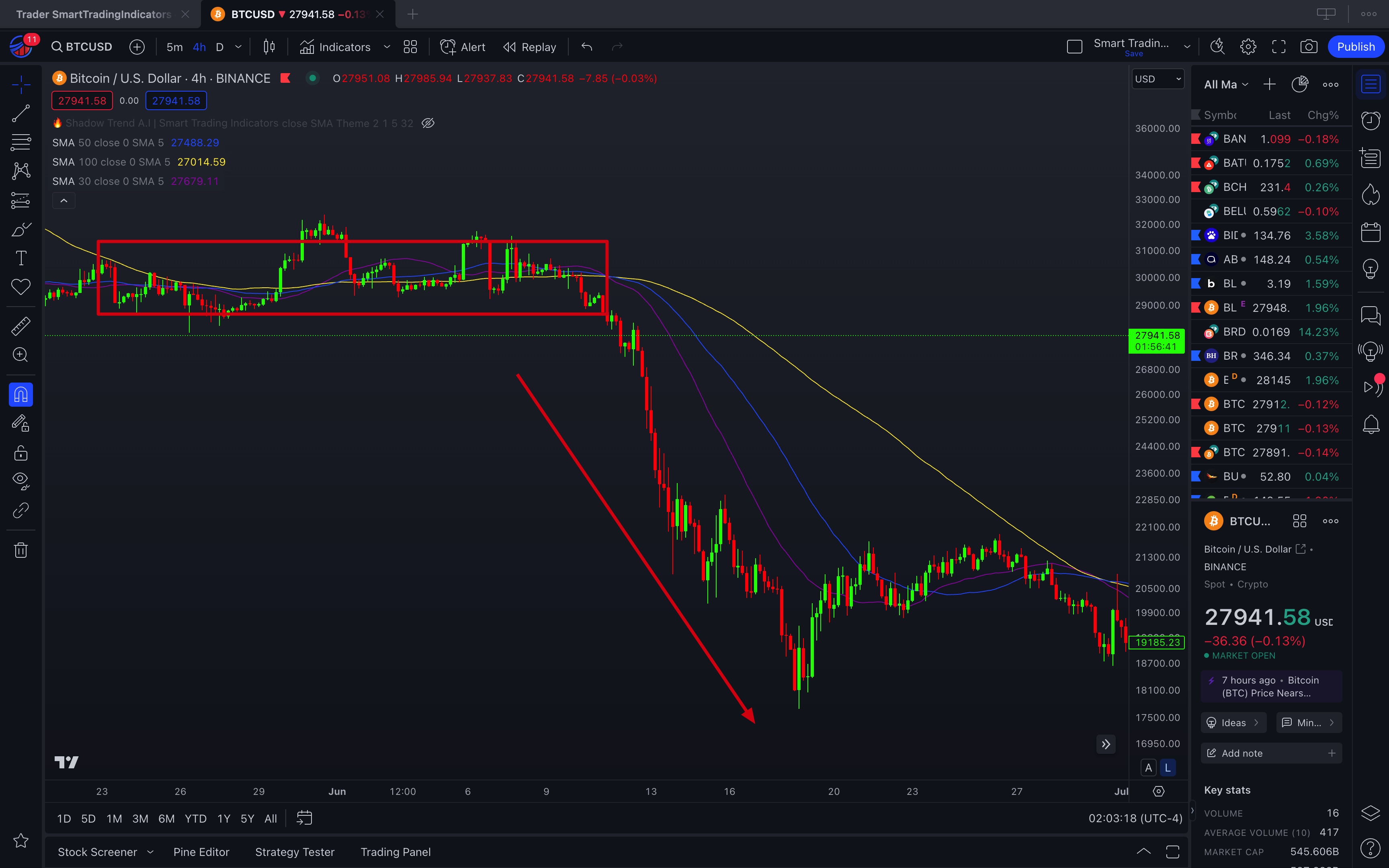
* **Interpretation:** Convergence after divergence can be a signal that the current trend is losing strength and may be about to reverse.
## **Moving Average Color Change Chart:**
* **Description:** Presents a candlestick chart with a 50-period EMA that changes color. The EMA line could change from green to red when candle prices fall below the EMA.
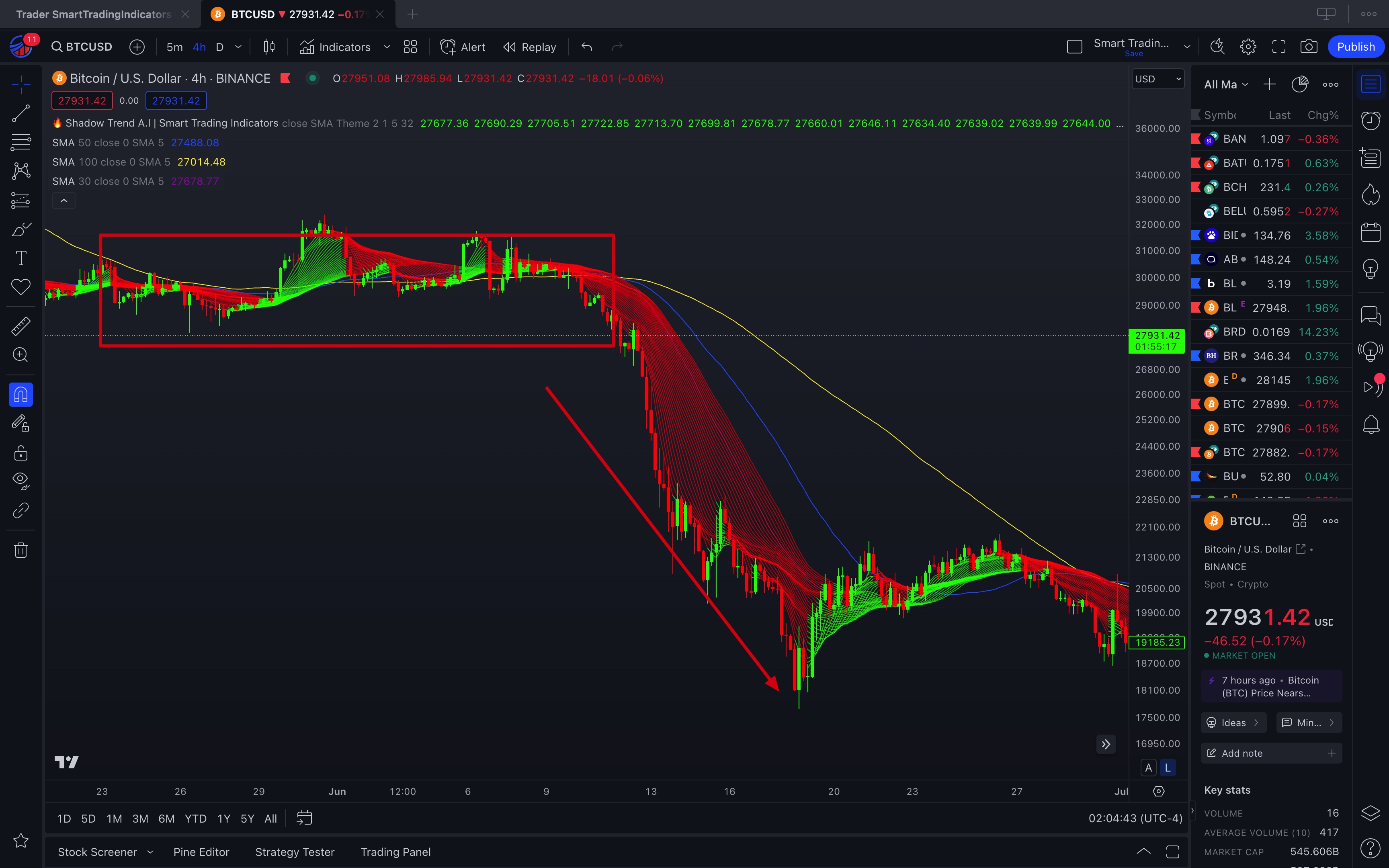
* **Interpretation:** A color change in the moving average can act as a quick visual signal for traders, indicating potential entry or exit points.
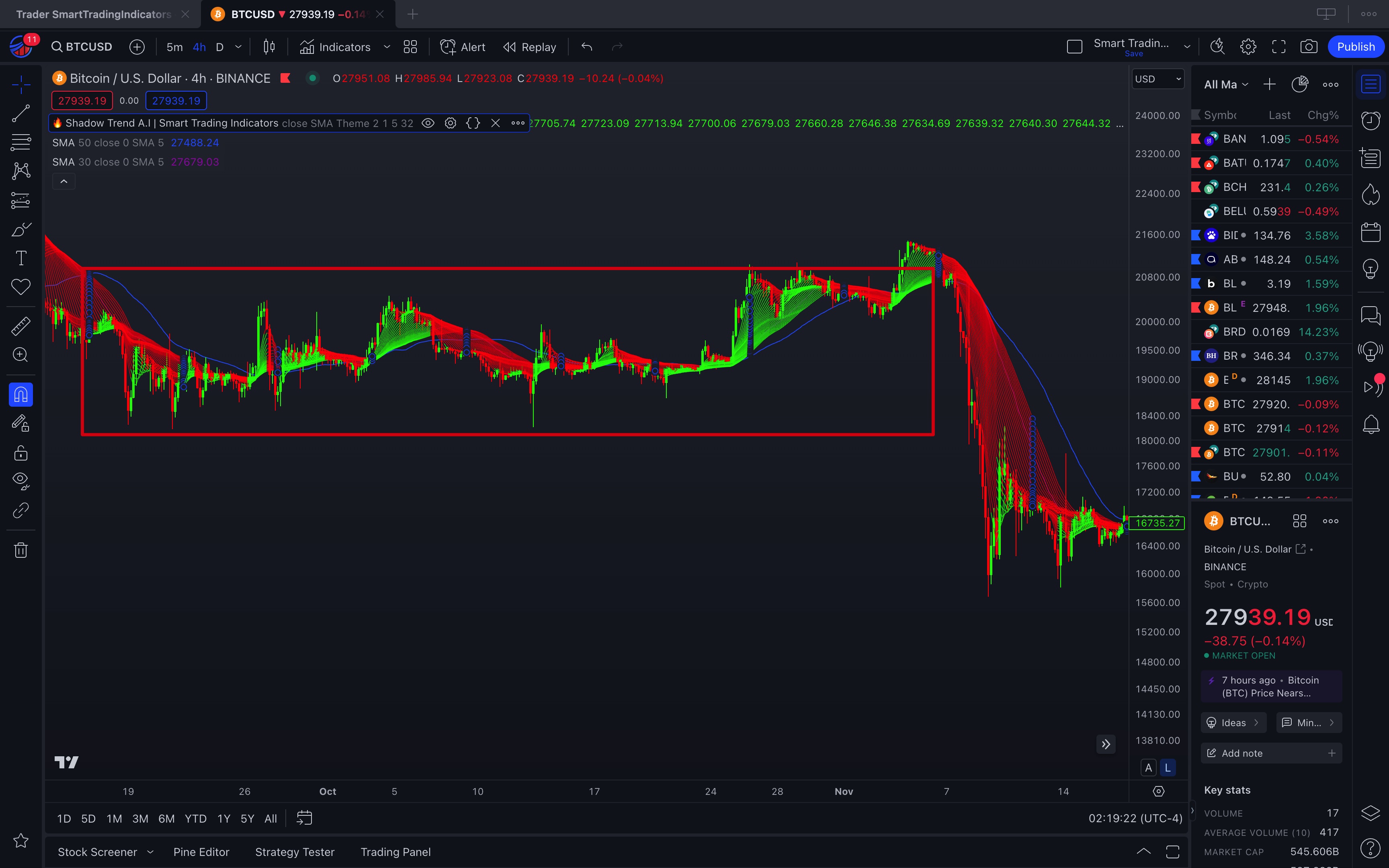
## **Multiple Crosses in a Sideways Market Chart:**
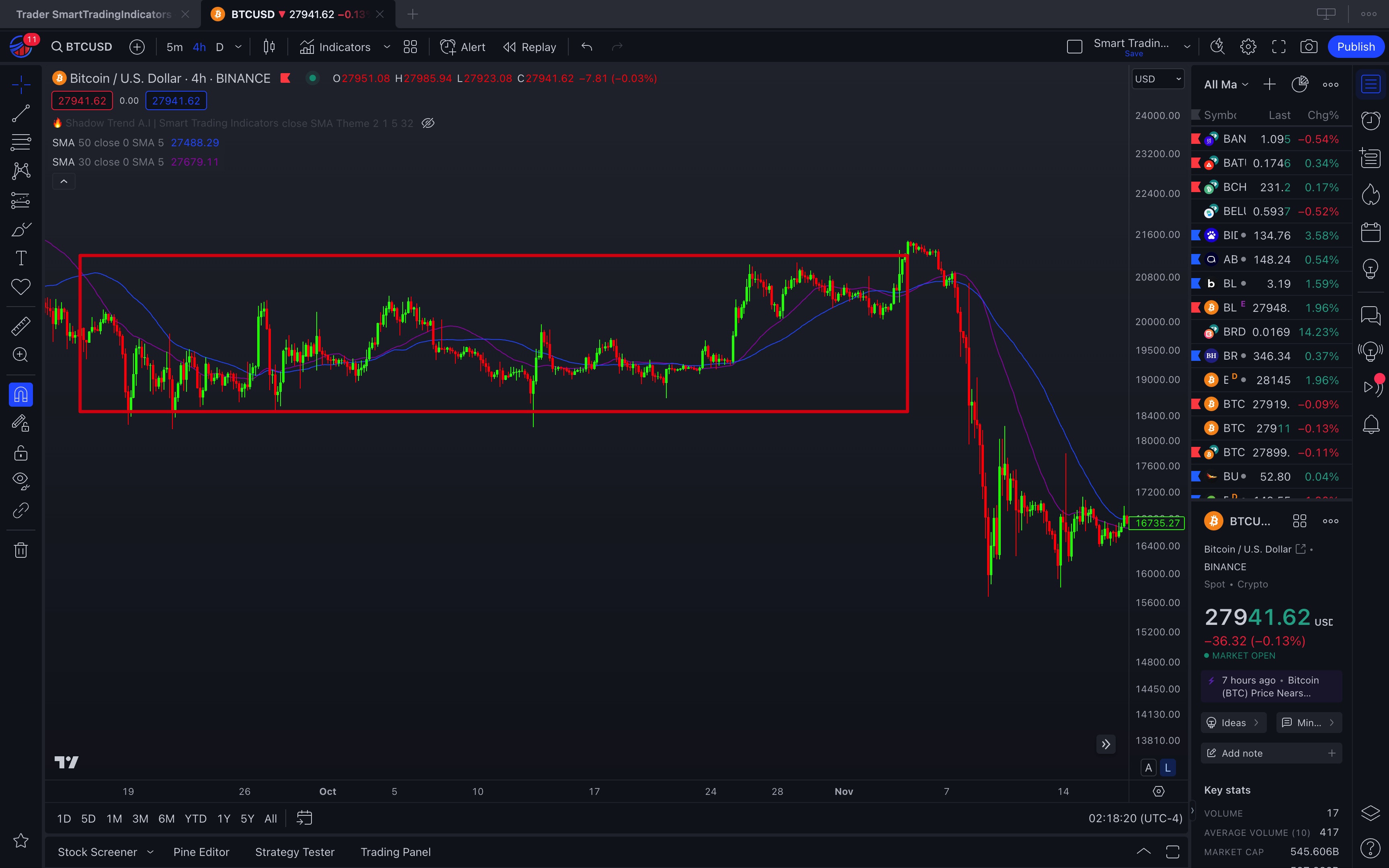
* **Interpretation:** In a sideways market or one without a clear direction, moving averages can produce many false signals. It's important to use other indicators or techniques to confirm signals in these scenarios.
For each of these examples, you should consider having a chart that clearly illustrates the described scenario, and possibly annotations or highlights on the chart to point out points of interest. Visual descriptions are essential for traders to understand and correctly use the "Shadow Trend" indicator."
.png?alt=media&token=ff2bedec-b390-4e16-a56c-f9dec4b9f75f)